
Design · 2026-10-11
Why typography can make or break a watch dial
The smallest letters and numerals often carry the greatest design responsibility.
By Chronolume digest · Original English summary · Based on Chronolume original analysis; background: Hodinkee
What to know
A watch dial is one of the smallest and most demanding pieces of graphic design most people encounter daily. Within a few centimetres, it must communicate time instantly while expressing the personality of a brand. A numeral that looks elegant on a poster can become clumsy at watch scale. Every stroke, space and alignment matters.
Typeface selection establishes a mood before the viewer consciously reads anything. Arabic numerals can make a watch seem functional, approachable or nostalgic, depending on their shapes. Roman numerals often suggest formality and tradition. Minimal baton indexes remove typography almost entirely, allowing proportions and surface finish to carry more of the identity.
Hierarchy is equally important. The hours should be easier to read than peripheral information, yet the brand name, minute track and complication labels must still have places in the composition. When all these elements demand attention simultaneously, the dial feels noisy. Skilled designers decide what the eye should register first, second and perhaps not at all.
Spacing is the invisible part of the craft. The relationship between a logo and the hands, the distance from minute markers to the case edge and the breathing room around subdials all affect balance. Even the length of a word can become a constraint. That is why an elegant typeface alone cannot rescue a poorly composed dial.
Colour, printing and surface treatment complicate the problem. White text on a matte black dial behaves differently from metallic printing over a sunburst finish. Applied numerals cast small shadows and make type feel architectural; printed numerals are flatter and often more direct. These are not merely manufacturing choices but distinct visual languages.
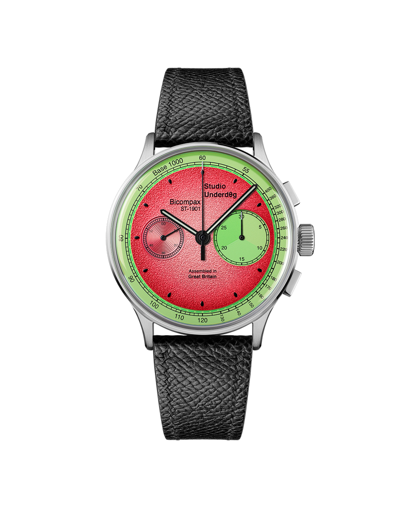
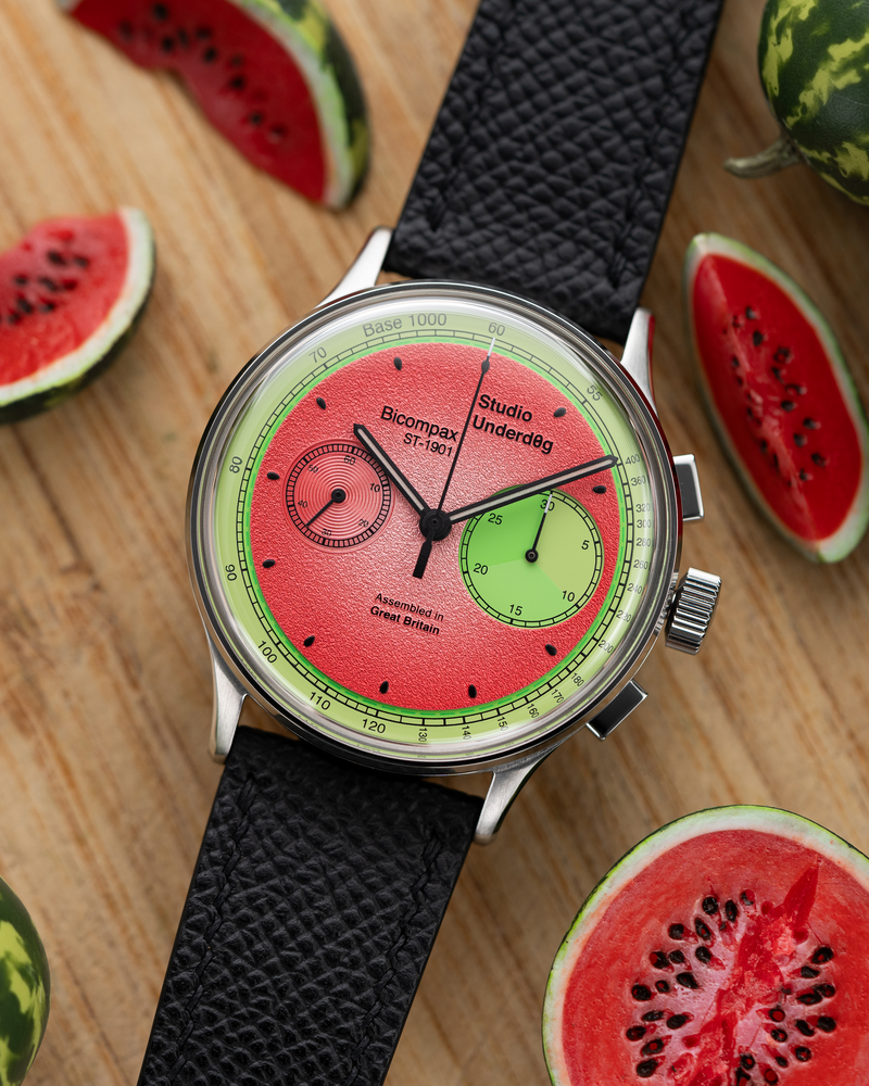
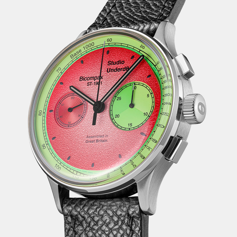
Look at the asymmetrical registers of a Studio Underd0g chronograph. The playful colours attract attention, yet a readable system of scales and markings is what makes the arrangement usable. Excellent typography is rarely the loudest feature of a watch. Its accomplishment is to make the whole object feel inevitable.
Source & attribution
Chronolume original analysis; background: Hodinkee · Published 2026-10-11 ↗
Related perspectives
Why case diameter tells only half the design story ↗
Beyond stainless steel: how materials shape a watch’s personality ↗