
Design · 2026-10-11
The psychology of colour in modern watch design
A single change in palette can transform an otherwise familiar watch.
Save this watch to revisit later.
By Chronolume digest · Original English summary · Based on Chronolume original analysis; background: RMS Zeitmeister
What to know
Colour is one of the quickest ways a watch establishes a mood. A black dial can read as serious or technical; cream and warm metallic tones often imply nostalgia; saturated green, orange or purple may signal energy and playfulness. These associations are not universal rules, but designers understand their power. Changing the dial colour can transform a familiar watch into an entirely different proposition.
The most effective palettes begin with hierarchy rather than novelty. The hands must remain visible, hour markers must separate from the background and important functions need clear emphasis. A bright GMT hand works because it is distinct from the local-time hands. A chronograph can use restrained colour accents to direct the eye toward the information that matters.
Contrast involves more than pairing light with dark. A glossy dial reflects its environment and can appear brighter or darker throughout the day; matte finishes produce a more stable visual reading. Sunburst brushing, fumé gradients and translucent layers complicate colour further, transforming one nominal hue into many shifting tones.
Material also shapes perception. Purple printed on metal looks different from purple seen through tinted sapphire. Ceramic produces a particular depth and consistency, while coloured anodized surfaces or lacquer may create their own visual character. The design challenge is to make these treatments support the watch's identity rather than distract from its basic function.
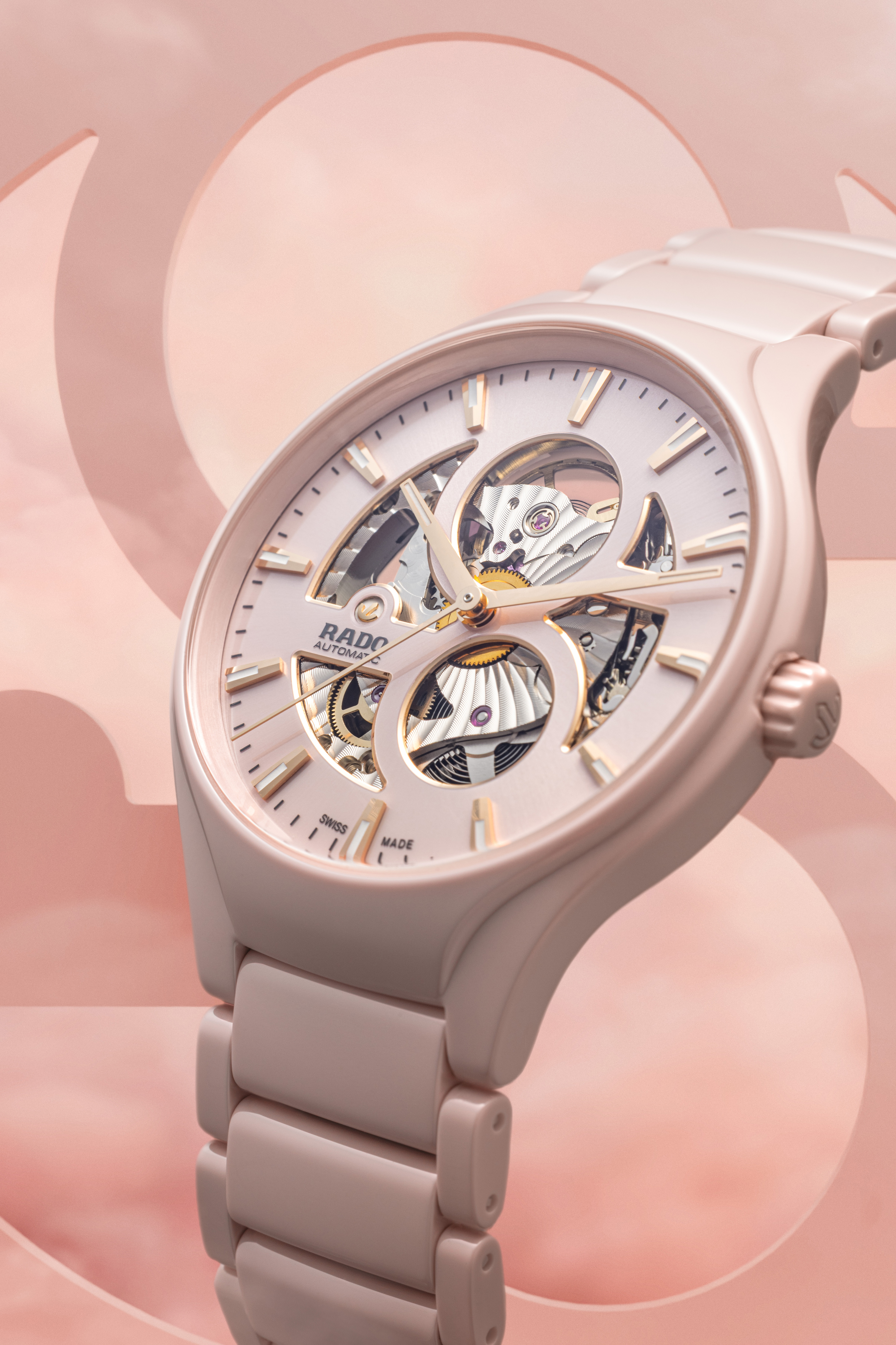
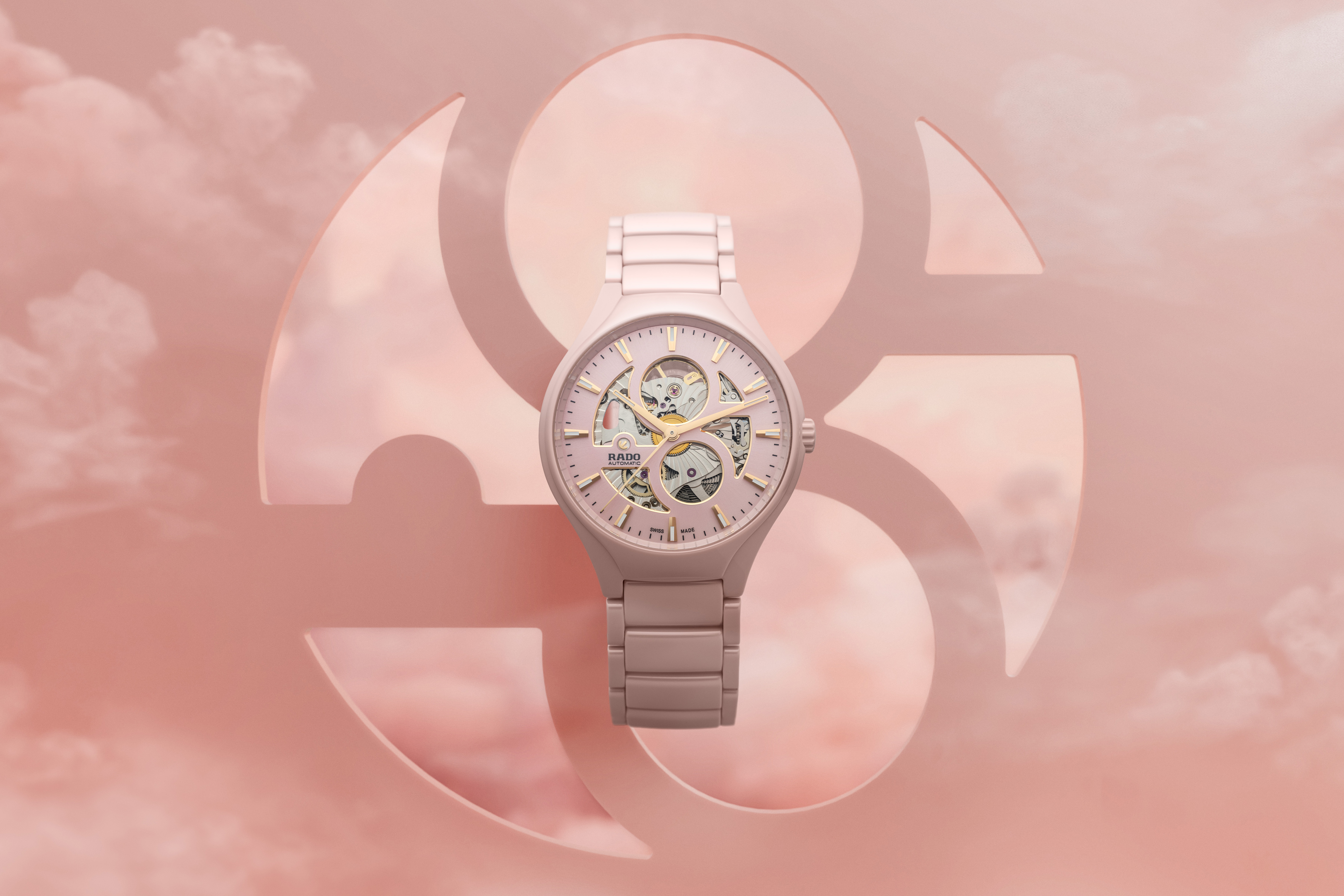
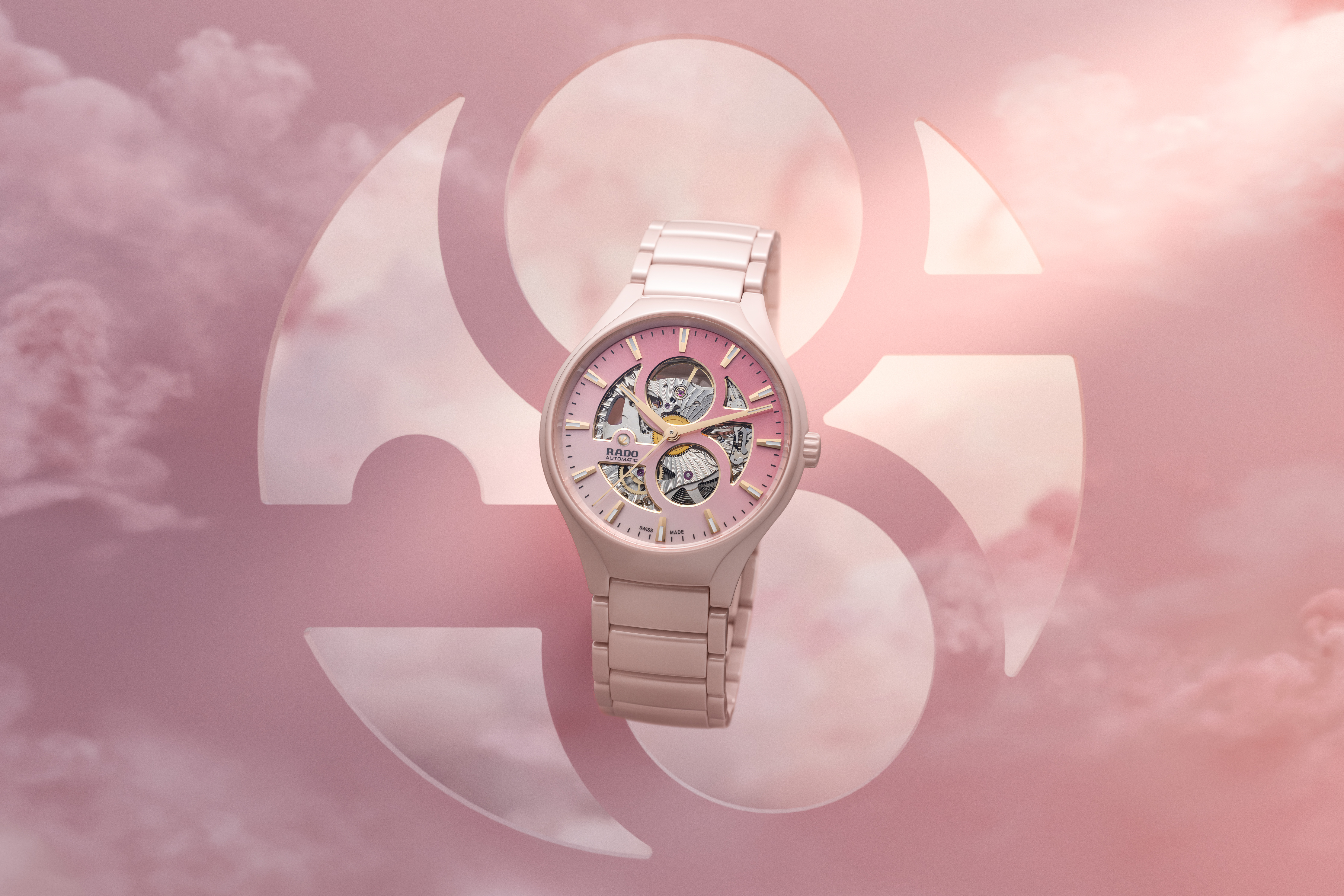
Rado's photochromic True Round makes the relationship between colour and experience unusually explicit. Its dial shifts from pale rose toward magenta in ultraviolet light. In this case, colour is not simply chosen once in a design studio; it becomes something the wearer observes changing under different conditions.
The most memorable colourful watches maintain discipline. One assertive accent may be enough, and sometimes a restrained palette benefits from a single unexpected detail. Successful colour design does not need to shout. It gives the wearer a recognizable identity, a functional visual system and a reason to look twice.
Source & attribution
Chronolume original analysis; background: RMS Zeitmeister · Published 2026-10-11 ↗
Related perspectives
Why typography can make or break a watch dial ↗
Why case diameter tells only half the design story ↗
Beyond stainless steel: how materials shape a watch’s personality ↗